
The word logo is defined as a graphic mark, emblem, or symbol commonly used by commercial enterprises, organizations and even individuals to aid and promote instant public recognition. Perhaps the operative words are “instant public recognition.” Through the years, the National Broadcasting Company has succeeded in creating iconic logos, especially one in particular. Read on.
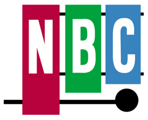 Today we will concentrate on the television era, but it is interesting to note that NBC’s signature radio chime sounds, using three distinct pitches: G3, E4 and C4 (middle C) successfully bridged NBC radio into the television era. During the television era spanning 1954-56, viewers saw an animated version of the NBC logo showing a mallet striking a xylophone producing the three tones. The logo made its debut on January 1, 1954, during the Tournament of Roses Parade.
WRAL joined NBC in December 1956, just in time to be a part of the Peacock era of the network. NBC dropped the xylophone for the Peacock on May 22, 1956. Matthew Thomson with Cayne Screen-printing submitted a design of an eleven-feathered Peacock to indicate richness in color. The Peacock first appeared as a still frame.
 On September 7, 1957 the animated Peacock began to strut its colorful plumage starting with the show “Your Hit Parade.” The “bird,” as it was referred to by the network, helped usher in the beginning of broadcasting in color. NBC was the first network to broadcast in color. The Peacock was useful in cross-promoting NBC’s parent company, RCA, which was a leader in manufacturing color television sets.
The first animated Peacock appeared on the screen in black and white and then transitions to color as the animation spreads the Peacock’s eleven feathers to full display. The voice over audio by Ben Grauer announces, “The following program is brought to you in living color on NBC.”
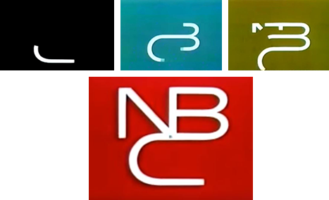
In 1959, NBC introduced a second logo that used a clever bit of animation. It became known as “the snake.” It slithered away in 1975. The screen started in black as the letter “C” forms. The lines “snake” up to form the letter ‘B” with a blue background. The line continues to form the “N” with a green background and then finishes with the complete logo of NBC over a background of red. The three musical notes chime one at a time as the three letters appeared.
The Peacock was not completely gone during the “snake” era. In 1962, the “Laramie” Peacock made its appearance. It was called “Laramie” since it premiered before the western/cowboy show “Laramie,” starring Robert Fuller. The “Laramie” Peacock only appeared at the start of NBC programs that were produced in color since some shows were still airing in black and white. It was also used to open programs produced by NBC, such as “The Tonight Show starring Johnny Carson.” The three note chimes gave way to a more robust orchestrated theme and the animation gave a dazzling flourish to the feathers. The Peacock was put out to pasture in 1975.

After letting the bird go, NBC decided to go with a bold, contemporary design. The logo consisted of two trapezoids. One red and the other blue. It became the official NBC logo on January 1, 1976. Nine days later it was mocked on NBC’s hit show, “Saturday Night Live.” SNL legendary comics Chevy Chase and Gilda Radner made fun of the logo during the “Weekend Update” segment. Radner even pranced around as the “Dancing N” in a costume that looked like the new logo.
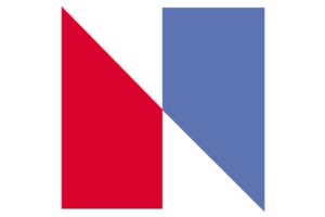
February brought more logo headaches for the network. Nebraska ETV, the PBS member network for Nebraska, filed a trademark infringement lawsuit against NBC. The NBC logo looked like a twin to the Nebraska ETV logo that had been in use since 1974. The only difference was the coloring of the right trapezoid of the NBC logo, which was blue.
Settlement was made-out-of-court. NBC was able to keep the “N” logo. The network gave Nebraska ETV over $800,000 worth of new equipment and a color mobile unit. NBC also paid Nebraska ETV $55,000 to cover the cost of designing a new logo.
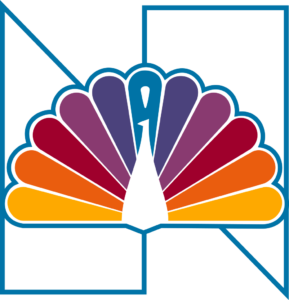
But this logo was not to last. After the lawsuits were settled, NBC brought back its tried and true logo, the Peacock. Research conducted in 1977 indicated that the Peacock was so readily identified with NBC that it had to return, so it was incorporated again into the network logo in 1979 by Fred Silverman, then President of NBC.
The Peacock received a contemporary make-over as well. All eleven feathers received teardrop tips that blended into the rest of the feathers. The Peacock’s body was stylized with a triangular shape and no talons. NBC was “proud as a Peacock” again.
Finally, the Peacock again took center stage as the logo for NBC on May 12, 1986. The simplified version of the bird, standing by itself – just as it did in 1957, premiered during the NBC 60th Anniversary Celebration television special. The Peacock was svelte with a simplified body, more elongated, and the head looking to the right to indicate that network was looking toward the future, not to the past. The eleven feathers of its previous Peacock logo were pared down to six to represent NBC’s six divisions: News (yellow), Sports (orange), Entertainment (red), Stations (purple), Network (blue), and Productions (green).
The Peacock says it all. NBC returned to its roots and is proud of it.
On Monday, February 29, WRAL-TV will return to its roots with the one who brought us to this television dance, NBC. We’ve come full circle…and we will be proud as a Peacock!
Thanks to Corp’s Pam Allen for this capcom story. Pam Parris Allen is a former WRAL newscast producer/director who now works as a researcher and producer on the CBC History Project.
SLIDESHOW: NBC Logos Through the Years
During the television era spanning 1954-56, viewers saw an animated version of the NBC logo showing a mallet striking a xylophone producing the three tones. The logo made its debut on January 1, 1954, during the Tournament of Roses Parade.
On September 7, 1957 the NBC animated Peacock began to strut its colorful plumage starting with the show “Your Hit Parade.” The “bird,” as it was referred to by the network, helped usher in the beginning of broadcasting in color. The first animated Peacock appeared on the screen in black and white and then transitions to color as the animation spreads the Peacock’s eleven feathers to full display.
On September 7, 1957 the NBC animated Peacock began to strut its colorful plumage starting with the show “Your Hit Parade.” The “bird,” as it was referred to by the network, helped usher in the beginning of broadcasting in color. The first animated Peacock appeared on the screen in black and white and then transitions to color as the animation spreads the Peacock’s eleven feathers to full display.
In 1962, the NBC “Laramie” Peacock made its appearance, called “Laramie” since it premiered before the western/cowboy show “Laramie,” starring Robert Fuller. The “Laramie” Peacock only appeared at the start of NBC programs that were produced in color. The Peaccock was put out to pasture in 1975.
In 1962, the NBC “Laramie” Peacock made its appearance, called “Laramie” since it premiered before the western/cowboy show “Laramie,” starring Robert Fuller. The “Laramie” Peacock only appeared at the start of NBC programs that were produced in color. The Peaccock was put out to pasture in 1975.
In 1962, the NBC “Laramie” Peacock made its appearance, called “Laramie” since it premiered before the western/cowboy show “Laramie,” starring Robert Fuller. The “Laramie” Peacock only appeared at the start of NBC programs that were produced in color. The Peaccock was put out to pasture in 1975.
In 1959, NBC introduced a second logo that used a clever bit of animation. It became known as “the snake.” It slithered away in 1975.
In 1959, NBC introduced a second logo that used a clever bit of animation. It became known as “the snake.” It slithered away in 1975.
In 1959, NBC introduced a second logo that used a clever bit of animation. It became known as “the snake.” It slithered away in 1975.
In 1959, NBC introduced a second logo that used a clever bit of animation. It became known as “the snake.” It slithered away in 1975.
This ‘N’ logo, consisting of two trapezoids, one red and the other blue, became the official NBC logo on January 1, 1976.
NBC brought back its tried and true logo, the Peacock, in 1979 because it was so readily identified with network. Fred Silverman, then President of NBC, incorporated the peacock with the previous ‘N’ logo that year.
The Peacock again took center stage as the logo for NBC on May 12, 1986. The simplified version of the bird, standing by itself – just as it did in 1957, premiered during the NBC 60th Anniversary Celebration television special.